Empowering Spotify users to generate tailored playlists on demand
This project was inspired by a product called Boil The Frog. The unique feature of this product is that it can create a seamless transition between two unrelated artists, by slowly paving the way from one to the other.
Because this very cool product didn’t take off, I wanted to discover the reason behind it and try to create a similar but more feasible solution that helps users create playlists on-the-go.
Since this is a project focused on developing the MVP of an app, I’ve decided to leave the name as PLAYLIST GENERATOR and a speaker as the logo until the project advances into next phases.

When people curate their own playlists, the genres, the moods, the tempos, or the artists can clash and cause an uncomfortable listening experience. This problem can be solved with an app that creates seamless playlists according to the users’ music needs, also helping them discover new artists.
Also, music is a strong concept that can manipulate or influence some people’s moods, so a playlist that can seamlessly shift from one mood to another has the potential to alter its listener’s overall mood to lead them to a desired mood state or energy level. Currently, a product that can create a playlist that leads users to shift their mood from one to another does not exist.
"To discover the thought patterns and influencing factors the users experience when they create their own playlists, to define a product that will improve the said experience while doing so."

I focused my research on two areas:
Some of the findings from the interviews were:
Based on research findings, I created two distinct Personas and their Empathy Maps I generated by synthesizing user research. While Jessica creates playlists for activities, Matt listens to playlists to discover new music. They both listen to similar types of music while studying/working.
I assume that there’s a group of users who are looking for faster and easier ways to create playlists with multiple genres/eras/energy levels for specific use cases, which creates a market for the proposed app being developed.


To evaluate the goals of each stakeholder, I’ve created a Project Goals Venn diagram, so I can define a solution that serves the common goals that intersect in the center, in addition to the business goals.
After identifying the necessary features the app has to contain, I created a Feature Roadmap to prioritize the essential features to develop, followed by an app sitemap. The nonessential features are left out of the project scope for the time being, to be developed in the future.
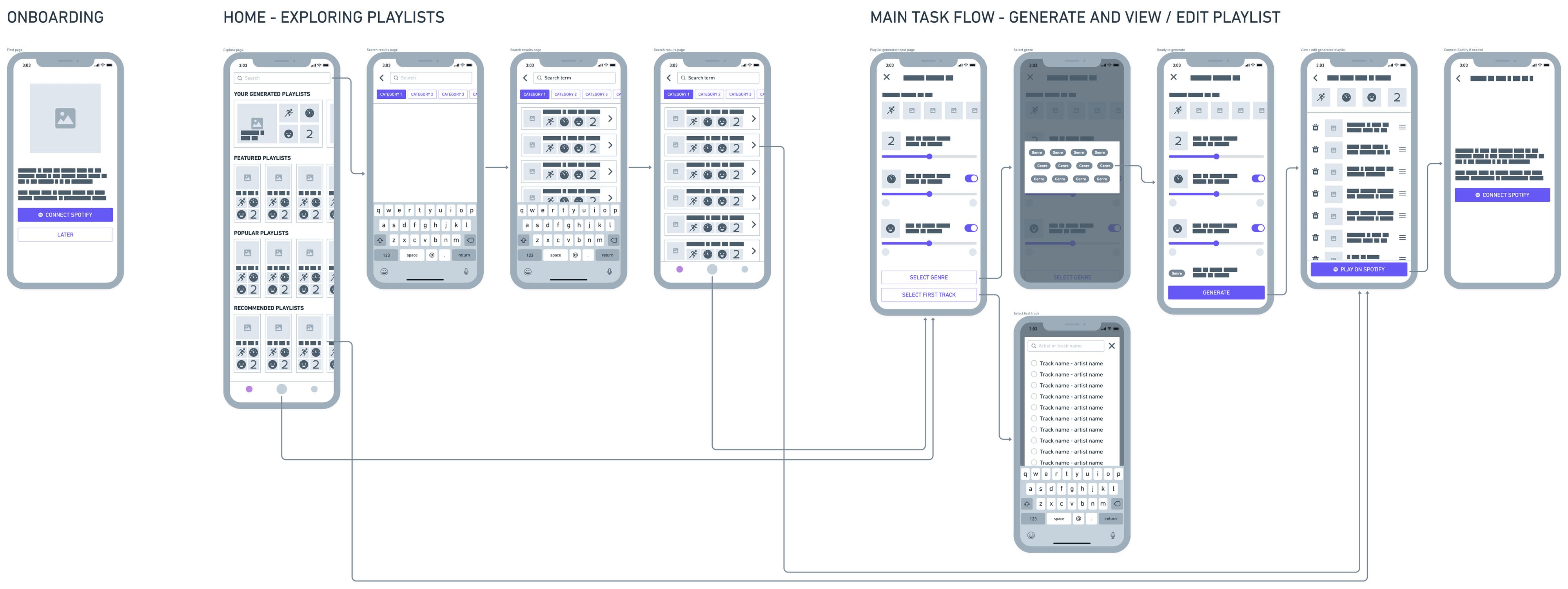
I planned the primary task flow of this app feature around a user who:


During testing, some participants thought the icons at the onboarding page were buttons, and they tried to interact with them. I added some text to that page to show it's a welcome page, and edited the icons to look less like buttons.
Also, I increased the onboarding to two pages, the second page being a legend of the cards used in the app.
4 out of 6 users felt more comfortable with horizontal cards over vertical card design, so I changed the card layout to horizontal.
Half of the users had trouble operating the toggles to activate and expand the ACTIVITY, TEMPO and MOOD cards. I then decided to simplify this interaction by removing the toggles and keeping the cards open at all times.
In addition, for users who are not familiar with BPM's, I added an informative pop-up to educate the user about BPM ranges.
I then created an affinity map and a priority matrix to evaluate the cost and effect of each recommended fix.


The more sophisticated I try to make the interactions, the harder it gets for the users to use. It is best to stick with the most basic interactions available in the OS.
Onboarding needs to be very simple and descriptive to prevent misconceptions.
During usability testing, one user asked: "What would happen if they delete too many tracks from the generated playlist; does the app bring new tracks or does the playlist get shorter?"
This question provoked me to reevaluate my decision to place that delete button into that page. After further contemplation, I've concluded that (1) the app should bring new tracks to preserve the length of the playlist, and (2) the user can delete the tracks after migrating it into Spotify, so why include it here too?
So, I've decided to replace the DELETE button with a REFRESH button.


