Preventing misinterpretation of a door sign by visualizing information
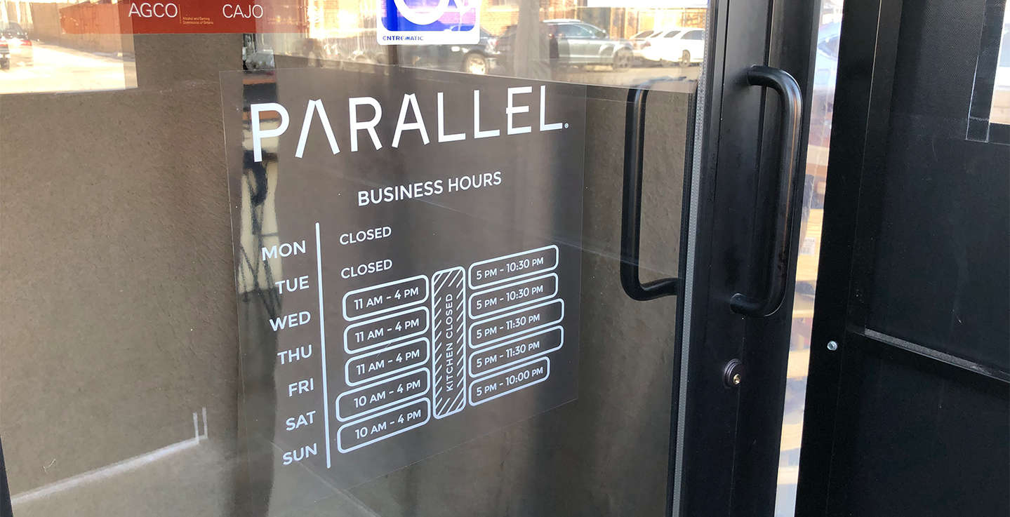
I redesigned Parallel Brothers' complicated business hours sign by visualizing data, since a significant amount of people were trying to enter the restaurant without reading the wordy sign.
The client was extremely satisfied with the final design, and number of people who forced the doors without reading the sign almost diminished.

One of Toronto's top Israeli restaurants, Parallel, approached me to redesign their business hours sign posted on their front door. Parallel takes pride in its uniqueness and attention to detail, so the design of their graphics deserve to receive the same attention.
The existing signage was a simple printed Word document which had the hours listed from Monday to Sunday. However, customers were trying to enter the restaurant outside operating hours (especially during the transition hours from 4-6pm) because they weren't reading the sign.
"Explore examples of data visualization to help develop a design which simplifies communication with visual elements instead of long words."

To get some inspiration, I researched examples of complex data visualization and wayfinding signs which were essential for transit terminals and large indoor areas like museums and parking garages.

Getting inspired from the research, I sketched a few ideas to visualize the complex sign, trying to use least amount of words as possible.
It was obvious that a simplification of this sign was an essential need, but business hours varied almost every day. Grouping days that shared the same business hours only worked for Wednesday and Thursday.


There were 7 revisions on the project, with differing business hours depending on the season and changes in service. Here are some of them.
Instead of vertically aligning the letters of "KITCHEN CLOSED - BAR OPEN" text, I realized it would be easier to read the text rotated 90 degrees counter-clockwise, making it appear like the spine of a book.

The information on signs like these need to be digested quickly, because the customer will not wait in front of the door for too long. Words should be replaced by familiar shapes wherever possible for quick understanding.


